You have /5 articles left.
Sign up for a free account or log in.
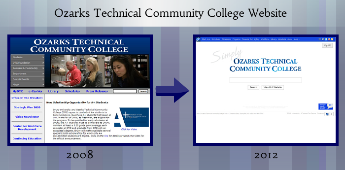
College and university websites are infamous for being cluttered and hard to navigate, so when Ozarks Technical Community College decided to redesign its site, it kept it strikingly simple.
The homepage of the new site evokes Google’s home page: there’s a small navigation bar on top and a giant search box front and center. The bare design lacks the classic quad photos, headlines trumpeting the college's latest accomplishment, or scrolling list of athletics results that adorn most college home pages. But its emptiness is eye-catching.
Granted, with one click the user can access the full website. But according to George Lamelza, director of web services at Ozarks, that’s not what users are doing. "Seventy to 80 percent of people choose the search box over a click," Lamelza said.
That was a trend Lamelza noticed when the homepage still boasted a more typical, content-rich design, too. When Lamelza arrived at the college about four years ago and began toying with the idea of revamping the website, he looked at the site’s analytics, and noticed that many users went straight for the search box. He tested that data by asking students to locate something, such as the student services page, from the OTC home page. Nine times out of 10, Lamelza said, students went straight for the search bar.
When designing the home page, then, Lamelza figured he would give students exactly what they wanted. He easily won the support of Chancellor Hal Higdon, too, by showing him the data.
"It’s really just a part of customer service," Higdon said. "It’s not a difficult decision because if you look at the data and you look at the analytics, it leads you to where you’re supposed to go."
|
| Click to view full image |
Experts in web design in higher education have mixed reactions to the unconventional approach at Ozarks, but applaud the college for looking to data to influence design.
"It’s definitely a really bold move," said Colleen Brennan-Barry, assistant director of college and community relations in charge of web communications at Monroe Community College, and a board member of the Higher Education Web Professionals Association, or HighEdWeb. "Whether this ends up being a success or not ... they have really strong underpinnings and really strong data, so they’re coming at it from a good place."
Mark Greenfield, also a member of the HighEdWeb board and the director of the Office of Web Services at the State University of New York at Buffalo, noted that the higher ed web industry as a whole is beginning to become more aware of and responsive to data about how users navigate websites. "The recognition that analytics matters is a huge step forward," Greenfield said, adding that he believes higher ed websites have reached a "tipping point."
At the same time, though, Greenfield was less enthusiastic about Ozark's new page. "I think they’ve gone too far with trying to be simple," he said. "It goes back to the basic web design process of, what is the purpose and function of a front page?"
To Greenfield and to others, one of the purposes of a front page is branding, and here, they say, the Ozark site loses out. "You don’t have any kind of marketing," said Chris Nixon, director of digital design and development at the University of Arkansas at Fayetteville. “To me that’s a pretty big drawback.”
Lamelza, however, wasn’t worried about branding in building the site, but about the primary user. "My mission totally was that this site has got to be student-centered," he said.
Experts agreed that deciding on a primary audience for the home page – whether that audience is prospective students, alumni, or any other group – is critical. College home pages can be among the hardest pages to design, they said, because institutions are trying to communicate so much information to so many different audiences, and there are so many different stakeholders vying for room on the front page.
“At the end of the day, somebody has to determine who your primary audience is,” Nixon said.
For a college that wants to be student-centered, then, an approach like the one at Ozarks might work. But, Greenfield is quick to note, it depends on the size and scope of the college – not every home page is geared just toward students. For example, Nixon noted that students at Arkansas rarely use the home page once they arrive on campus, because they simply go straight to Blackboard or whatever other internal pages they need.
The bare-bones approach does create some challenges, too, because such heavy emphasis on search means the search engine must work extremely well. Lamelza said he and his staff are constantly working to refine the search engine, and notes that the search function is based on Google servers.
Since the site was launched on August 20, Higdon said he has received only positive feedback from students. Lamelza has a few tweaks planned for the website already, too, but right now he, along with many other web designers, is waiting to see what the data say.
"There’s been lots of discussion about pros and cons," Brennan-Barry said. "I think a lot of us are waiting to see what happens at Ozarks."