You have /5 articles left.
Sign up for a free account or log in.
Travis Grandy is a PhD student in Composition and Rhetoric at the University of Massachusetts Amherst. You can find him on Twitter @travisgrandy or at his website.
Do you ever feel like you want to get more out of your syllabus? Sure, it plays center-stage during the first day of class, but does it really have to end there? Perhaps it’s a matter of presentation.
I've often experienced the frustration of writing a carefully detailed syllabus only to see my students tuck it away in a folder never to be seen again (assuming they read it in the first place). For some instructors this may not actually be a problem—the syllabus can be just like a contract for describing rules, requirements, and procedures, and only comes up again when those rules need to be enforced. Despite being detailed, I wasn’t happy with my syllabus because 1) even with a thorough (some might say “iron-clad”) syllabus, I still had to respond to the same student questions over and over again, and 2) I felt my course needed a larger narrative that unified learning outcomes with course requirements, and expectations about the day-to-day work students do in my class.
A few years into my career teaching first-year composition, I found my syllabus had ballooned to over two thousand words, single-spaced, with a smattering of bullet points. When I came across a blog-post about “Creative Approaches to the Syllabus” it got me thinking that perhaps some of the challenges I was having with students using my syllabus were actually a design problem.
This inspired me to undertake a dramatic redesign of my syllabus to not only make the content more useful for my style of teaching, but also easier to use and visually engaging. My revised syllabus ended up being full-color, using illustrations and visual metaphors to convey content, and was intentionally designed help students more easily find the information and get excited about the core purposes of the class (see more about this below). A well-designed syllabus can also be a way to make a new course proposal really stand out—provided the content lives up to the design of course.
Therefore, GradHackers, I challenge you to take some time before the start of the new academic term to try your hand at redesigning your syllabus. You might be saying, “That’s nice, but I’m no designer…” but don’t count yourself out! Below are some strategies for redesigning the content, layout, and presentation of your syllabus (including tips for non-designers), and ways to better integrate a syllabus into your teaching so it can work for you, not against you.
Having Your Syllabus Reflect What You Value Most
I don’t want to give the impression that a designed syllabus should come at the expense of being detailed about your classroom policies (as well as meeting institutional requirements for what should be listed on a syllabus). Instead, I’m suggest using design elements to draw attention to the things about your course that you most want to stick with students.
1. Foregrounding What’s Essential: As you redesign your syllabus, you should start by asking yourself what’s the most important thing you want students to get out of your class. Since the syllabus might be a student’s first impression, it’s a great opportunity to set the tone around things like overall learning outcomes, how students can get the most out of the course, and how they can best utilize you as a resource.
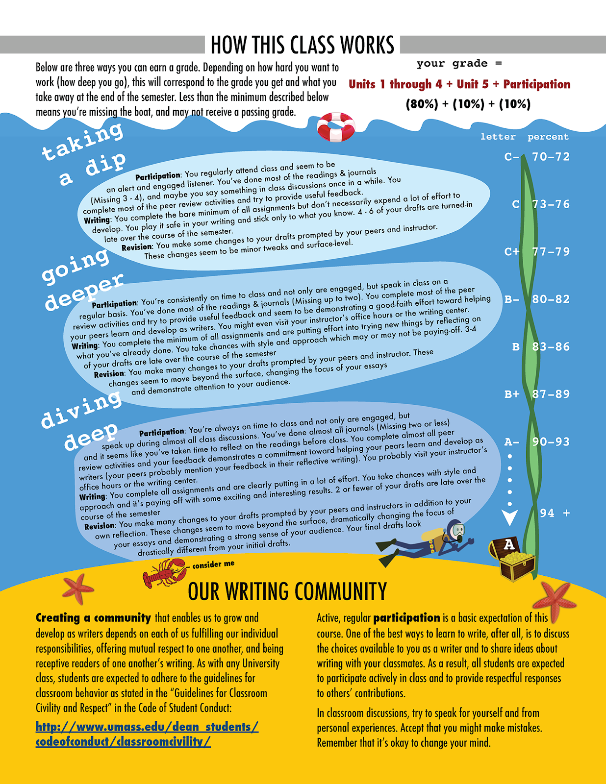
2. Anticipating Pitfalls and Designing Around Them: A common pitfall I experienced with my traditional syllabus was students were frequently focused on how to get the grade they wanted (and since this was a writing class, this question often took the form of “What do I need to write to get the best grade?”). Since the final grade was actually a combination of revision, peer feedback, class participation, and final drafts, I needed to draw attention toward other aspects of their participation, not just their written work. This prompted me to write about levels of class participation in a narrative that was set against the metaphor of “diving deep” (see below), that helped me put expectations for participation in very concrete terms, and helped students understand how this translated into a grade.
Tips for the Design Process
Even if you don’t have a background in visual design, breaking yourself out of paragraphs and bullet points can go a long way toward making your syllabus more engaging. Remember, a wall of single-spaced text is not the only way!
1. Starting from a Template: There’s no shame in using a template in order to start your new syllabus with a solid layout. I’ve personally had a lot of success adapting two-column newsletter templates in Microsoft Word and Pages (Mac). Templates can include great options like a table of contents to make your syllabus easier to reference.
2. Getting Visual: To the right is a page from my redesigned syllabus explaining my grading philosophy and expectations for class participation. Since my writing class factored participation as a significant portion of student grades, a visual metaphor (in my case, a scuba diver) helps to reinforce the larger outcomes of the class, especially in how students were expected to collaborate in peer review. A visual doesn’t have to be elaborate, but strategically using images, shapes, or flow-charts can be an equally effective way of drawing attention to the most important parts of your syllabus.
3. Being Accessible: While it’s great for your syllabus to make an impression, you also want to make sure it’s readable for all students. This can include providing your syllabus in multiple formats (both analogue, digital, color, and grayscale), and also using easy to read fonts and high contrast colors. If you don’t have the resources to spring for color printing, make sure to preview how your syllabus will look in grayscale.
4. Building Your Design Knowledge: Taking on a design project can be a great way to educate yourself on effective design practices and visual rhetoric. If you’re just starting to dip your toe, you might want to consider taking a look at The Non-Designer’s Design Book and Thinking With Type: A Critical Guide for Designers, Writers, Editors, & Students.
Beyond the First Day of Class
If you devote time to making a thoughtfully designed syllabus, make sure you keep using it after the first day of class! Below are two suggestions that can help you reference the syllabus so you can keep driving home important concepts and outcomes.
1. Using the Syllabus at Key Moments: A great time to ask students to take out the syllabus is when you transition between major units or assignments of the course. You can lead students in a conversation about ways the work they just completed addressed some of your broader course learning outcomes. You can even turn this into an in-class activity such as having students write a short reflection about how their work in the previous unit helped them develop competencies or achieve course outcomes.
2. Reinforcing Concepts from Your Syllabus in Assignments and Grading: You can reinforce the concepts from your syllabus by using them consistently in other course documents including assignment prompts and grading rubrics. For example, it’s great to reiterate course outcomes, especially as it provides context and purpose for the work students will be doing. In my case, I reused my “diving deep” metaphor when I wrote my grading rubrics.
Special thanks to hari stephen kumar (@hariteach) who collaborated with me on this project.
Feel inspired to try a new layout or incorporate more design elements into your syllabus? Do you already have a syllabus that’s innovating and engaging? Feel free to link in the comments below!
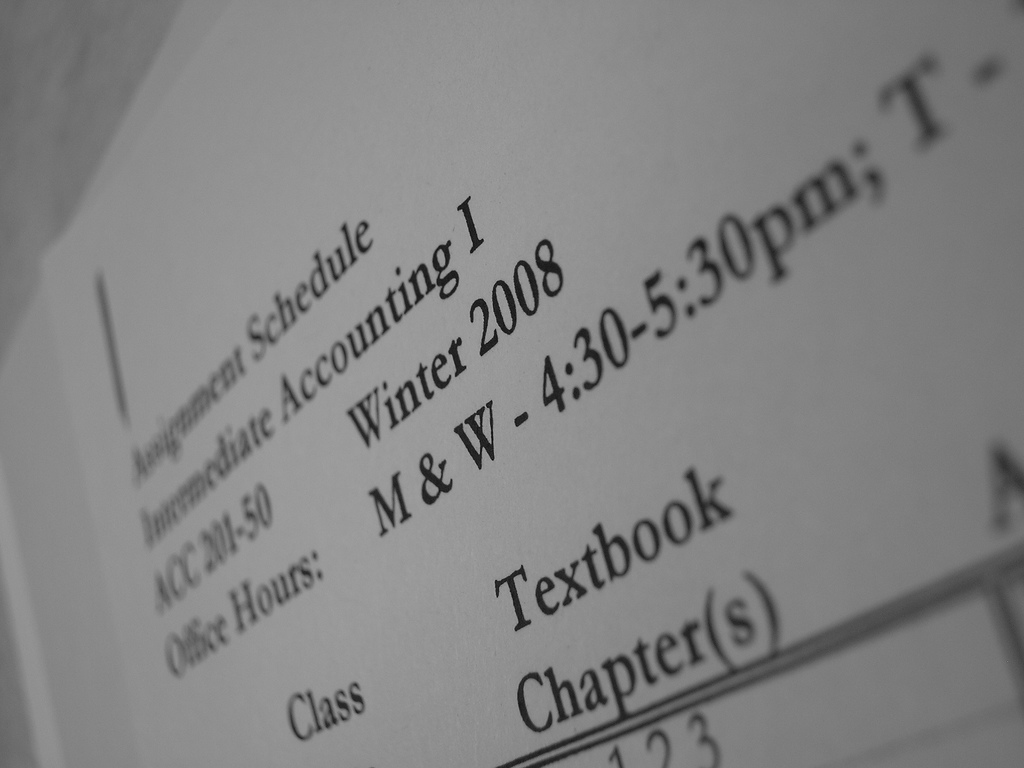
[Image from Flickr user, EmmyMik, used under Creative Commons license]