You have /5 articles left.
Sign up for a free account or log in.
Using MyLA, students can see three different data visualizations to stimulate their learning, including an assignment planner that helps students track their grade progress and assignments completed.
University of Michigan
A March survey by TimelyCare found 59 percent of college students measure their success in college by their grade point average. To help students succeed in meeting their goal grades, faculty at the University of Michigan equipped students with learning management system data.
My Learning Analytics (MyLA) is a student-facing dashboard embedded into Canvas that gives students up to three visualizations, pulling data from students and their peers in a course to provide insight into study habits and help them meet their learning goals.
Since launching in 2018, the software has benefited thousands of students at UMich and has been piloted at eight other campuses around the country.
The background: Stephanie Teasley, a professor in the school of information, first had the idea to create a student-facing dashboard after working with UMich stakeholders to create a dashboard for academic advisers.
The university was transitioning to Canvas, which provides course analytics for instructors, but that data is not easily accessible to students in the course. Teasley saw practical applications for equipping students with their data to benchmark work in the course and to compare their progress against their peers.
“Self-regulated learning talks a lot about monitoring and reflecting on what you’re doing, and I think that’s hard for students to do,” Teasley says. “’Am I keeping up? Am I doing what I’m supposed to do? How am I doing? How am I doing compared to everybody else in the class?’”
Teasley, alongside faculty from the school of education and school of information, partnered with Jennifer Love, a business systems analyst with Michigan IT, and her team to build the dashboard from scratch, with a goal of it being open-source and user-friendly, as well as requiring little to no resources to implement.
How it works: MyLA is designed to boost students’ self-directed learning, helping them monitor their progress and plan out future activity. Faculty members can choose to add MyLA to any course on the LMS. Once enabled, instructors can choose which of three visualizations they want students to access:
- Resources accessed. MyLA will show which files, videos and other resources are accessed most often by students in the course. The chart highlights used resources as blue and not-used resources as gray, encouraging the learner to make use of popular files. Students can also filter by week in the term, type of resources and the grade range of students accessing resources.
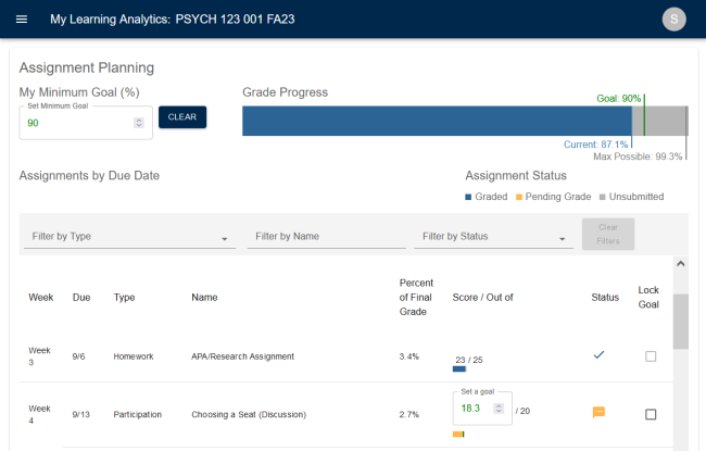
- Assignment planning. In this visualization, MyLA allows students to set a minimum course grade and creates a bar showing current grade, maximum possible grade and minimum goal grade. Students can also view their upcoming and past assignments by weeks as well as each assignment’s point values, due dates and grades for completed assignments.
- Grade distribution. Students can compare their grades to their peers’ grades in the grade distribution visualization, highlighting average and median grades. An individual can also see their grade in the distribution by clicking “show my grade.” This feature is not available to classes with 10 or fewer students.
One of the benefits of the program is it requires little work from the faculty member other than turning the feature on, it does not require historical data and it’s fully integrated into the Canvas system, making it familiar to students.
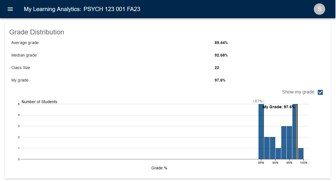
Using the grade distribution visualization, students can see where their grade aligns with their peers’ grades in a course. This feature can only be used in classes with more than 10 students and the bottom five grades are grouped together to protect student privacy.
University of Michigan
Faculty members cannot use the dashboard like a student would (viewing individual data), so student data privacy is protected. It is also not recommended to share the grade distribution dashboard in courses of 20 or fewer students because it could be easy for a student to identify their peers’ grades on the chart.
The dashboard is hosted on Unizin’s data platform, a data consortium to which the University of Michigan belongs.
The impact: During the first term, MyLA was integrated into three courses, reaching 313 students. The pilot phase ran for about a year and a half before any faculty member could utilize it, Love says.
As of this winter, MyLA has been utilized in 670 courses across the university, reaching over 40,300 undergraduate and graduate students.
At the end of each term, staff deliver feedback surveys to the courses who implemented the visualizations to collect feedback and refine the program.
Students who use MyLA say it changes how they study, their confidence in course materials and how they plan their course activities. There’s no difference in the cumulative GPA among students who use the tool versus those who don’t, meaning it hits all types of students, not just the highly academic ones.
Six in 10 students say MyLA was influential for studying and preparing them for exams and 89 percent said it was valuable for their course performance. The grade distribution chart is the most viewed element, with 87 percent of student users accessing it.
Among students who didn’t utilize the software, most said it was because they didn’t know it was available or forgot about it.
One concern for the dashboard may be students’ perceptions of their performance or a negative comparison between themselves and their peers. However, faculty found many students (43 percent) did not report experiencing increased anxiety as a result of viewing MyLA. Of those that did, most reported “slight” or “somewhat increased” anxiety, and this was consistent across the three visualizations.
“It may be that a certain amount of underlying anxiety may be motivating,” Teasley says.
Scaling up: Since launching, the dashboard has been implemented at other institutions across the country, including Oregon State University, Indiana University and the University of Minnesota, Twin Cities, many of which are members of Unizin.
The University of Florida piloted the software in 2022 and over 3,000 students in 20 courses tried the software during that fall semester. Similar to Michigan’s studies, UF surveys showed students found the data helpful for planning course activity, studying and improving their confidence in material understanding.
In the future, Teasley and Love see an opportunity to incorporate generative AI into the visualizations, helping to distill data further into student profiles and making the dashboard more responsive to the individual student needs.
If your student success program has a unique feature or twist, we’d like to know about it. Click here to submit.