You have /5 articles left.
Sign up for a free account or log in.

Erhui1979/digitalvision vectors/getty iamges
Nearly every piece of writing produced inside an institution of higher education has numbers in it. Lots of numbers. And as data become easier to produce in this digital age, academic writing will likely include even more numbers in the future.
Too often, however, we insert numbers into our papers and reports without considering the words we’re wrapping around them. Or we export data into the default graphs in our spreadsheet software instead of developing visualizations that engage and inform the reader.
Here are seven tips for writing effectively about numbers, followed by step-by-step advice for creating a compelling data visualization.
1. Do the math. If you want your reader to easily understand the data you’re using and any conclusions you draw, you may literally need to do the math. It’s not enough to spill numbers onto the page. Tell your reader what the relationship is between them.
After you’ve written a sentence, consider whether the story you’re trying to tell is immediately apparent or whether the reader has to do math in their head to figure it out. That mental arithmetic disrupts the flow of your writing. Moreover, some people find it challenging, and no one appreciates having to do it. For example, if carbon dioxide emissions increased from 17.8 gigatons in 1980 to 34.2 gigatons in 2020, say they “nearly doubled” over that 40-year period. If the raw data would be useful to the reader, couple them with an explanatory narrative. Say “Emissions nearly doubled, rising from 17.8 gigatons to 34.2 gigatons.”
2. Provide context. If you’re telling a story with numbers, provide sufficient context for your reader to understand the significance. For example, when describing a change over time, give start and end dates. Don’t just say, “Exports were up by $1 million in March.” Explain what time periods you’re comparing. It could be that exports were $1 million higher than in February, or that exports were $1 million higher than in the previous March.
When reporting on survey data, explain the relevance of a finding. Was a question asked in an open-ended manner, or was a selection made from a menu of options? If there was a menu, what else was on it?
For example, if you’ve written that most respondents said a candidate’s position on a particular issue was “important” in determining their vote, consider the other options on the survey. If “very important” was also listed but few people selected it, disclose that, too. You’ll paint a more complete picture of how much voters care—or don’t care—about the issue.
3. Be careful with averages. Averages are tempting because they provide one tidy number, but the question to ask yourself is whether the average tells the full story. A good way to decide is by looking at the distribution that the average represents. If the numbers are close to one another, using an average is fine. If they’re far apart, an average may do more harm than good.
For example, it could make sense to describe a community where residents’ incomes range from $50,000 to $70,000 as having an average income of $60,000. But if half earned less than $50,000 while the other half pulled down over $1 million, it would be misleading to say the average income is approximately $500,000. No one who lives there is making that amount, yet that’s the picture you’ve painted.
4. Avoid percentage confusion. Percentages are wonderful for describing a situation at a point in time. A statement like “Eighty percent of our students graduate within six years” is straightforward. The trouble begins when we use percentages to describe a change over time or to make another comparison, because it requires the reader to do or understand math. For example, a 100 percent increase means something has doubled, while a 200 percent increase means it has tripled. That is not common knowledge.
Similarly, readers are often tripped up by the difference between percentages and percentage points. We react very differently if we are told the risk of getting cancer is 50 percent higher if we engage in a certain activity than if we are told the risk is one percentage point higher. Yet both could be true—if the risk rises from 2 percent to 3 percent. The 50 percent increase sounds terrifying, and some people may even think it means that there is a 50 percent risk of getting cancer. The one-percentage-point increase sounds like a potentially acceptable risk. Think about the impression you want to give your reader.
5. Compare apples to apples. Even trained writers like journalists sometimes make the mistake of mixing apples and oranges. I once read a media report explaining that in Kenya, “there are around 40 cardiologists for the entire population of 48 million people,” while in the United States “there is one cardiologist for every 13,000 people.” It’s difficult to compare those two statements unless you do some further calculations. Perhaps the writer was compelled by the statistic that there are only 40 cardiologists in all of Kenya, which is indeed striking. But once the comparison with the United States is introduced, the numbers get confusing. A better approach would be to say: “There are only 40 cardiologists in all of Kenya. That’s one for every 1.2 million people, compared to one for every 13,000 in the United States.”
6. Avoid false precision. Our brains are wired to assign unnecessary weight to numbers stated precisely, such as with a string of decimals. When providing an estimate or an illustrative number, round it to avoid conveying a false sense of precision. Say that it will cost your department $350,000 to implement a new technology, not $348,073—even if that’s the figure you estimated in a spreadsheet. If a precise figure is not necessary to your argument, rounding it also makes it easier to absorb. Say that approximately six million people live in a particular state, even if the most recent count was 5,861,083. That said, it’s appropriate to give a precise number when it’s meaningful. If a stock is trading at $157.75, you wouldn’t say it’s trading at $160.
7. Choose relatable units. Express numbers in terms your reader can visualize or imagine. When communicating with the public, keep in mind that most people can’t get their heads around millions or billions, and percentage changes sound abstract. But talking about dollars per person gets their attention. One of the most powerful criticisms of the pharmaceutical industry’s role in the opioid epidemic was the revelation that companies shipped hundreds of pills per resident to some counties, a more relatable statistic than the millions of pills per county.
Creating Compelling Data Visualizations
Adding visuals is another way to incorporate numbers into your writing. The power of a good visual is that it helps readers absorb and retain information. It can also make your writing more persuasive. Studies have found that consumers are more likely to believe a product is effective if a description of the product is accompanied by a graph, even if the graph provides no additional information.
The best visualizations are often the simplest ones. The more quickly your reader can understand your visualization, the less it will disrupt your flow.
You can use standard office software to design basic visuals like bar graphs, line graphs, pie charts and tables. There are many other kinds of data visualizations to explore, including word clouds, waffle charts (grids with some of the small boxes filled in), dot plots (where dots take the place of bars or lines) and maps.
Use traditional maps with caution, however, because the uneven geographic distribution of human populations can distort the visual effect. In the United States, for example, some of the largest states by area have the fewest people. (Think of Alaska or Montana.) To show the footprint of an organization or the prevalence of a problem, add appropriately scaled dots on top of a state or country rather than simply coloring it in. Or use a cartogram, which is a map that has been resized to avoid geographic distortions.
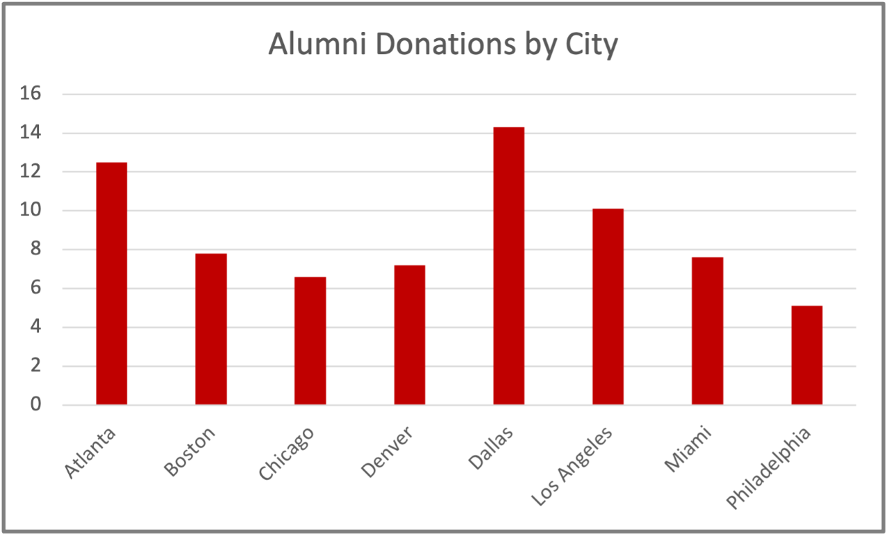 I describe below a step-by-step approach to transforming a basic graph generated by spreadsheet software, like the “before” version shown here, into a streamlined, compelling data visualization.
Step 1: Arrange your data in a logical pattern. A bar graph is easier to read if the bars are ordered by height (or length, for a horizontal graph). This allows the reader to quickly judge relative sizes and draw conclusions. You can’t do this for a bar or line graph that shows a time series, but many graphs lend themselves to reordering. Similarly, a pie chart is easier to read if the largest piece (which should begin at the 12 o’clock position) is adjacent to the second-largest piece, and so on.
Step 2: Draw the reader’s eye to the key elements of your visual. Use an arrow, a circle, shading, a heavier line or a different color. Color sometimes has the added advantage of conveying meaning and can give the reader a snapshot of the situation. For example, if you are presenting a table of numbers, you can color negative indicators red, positive indicators green and any neutral or in-between indicators yellow. Just make sure your visual can still be understood without the red-green distinctions, since many people have some degree of colorblindness.
Step 3: Provide horizontal labels and avoid legends. Apply labels directly to the relevant elements of your graphic—above a bar, on a pie slice, adjacent to a line or on an axis. Orient the text horizontally, so readers don’t have to tilt their heads. And avoid legends if you possibly can. They create an undesirable two-step interpretive process, which you can prevent by applying labels directly to your data elements instead.
Step 4: Strip out unnecessary elements, like extraneous gridlines. Look at your data visualization and ask yourself if you can remove any elements to simplify the image without taking away necessary content. Gridlines are a likely candidate, particularly if you have already labeled each data point, or if your purpose is to demonstrate a trend rather than to convey specific numbers.
Step 5: Provide a helpful title. Your data visualization shouldn’t be an intelligence test. Crafting an informative title tells your reader what the point is. It also ensures you know the answer to that question yourself. If you are struggling to write a good title, you may have dumped data into a visualization without thinking enough about why you want the reader to see it.
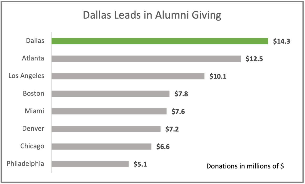 The “after” version here reflects those five simple improvements. All these steps can be taken even if you are working with basic spreadsheet software. Additional possibilities open up if you have access to more sophisticated tools, but you can get far even without design software or skills.
Making these changes will take you only a few minutes once you get the hang of it. But it will save your readers substantial time if you follow these simple steps, along with the tips for writing about numbers that I’ve suggested above. More importantly, your readers will be more likely to absorb the information and have it stick with them over the long haul.