You have /5 articles left.
Sign up for a free account or log in.
University of Dayton officials on Tuesday denied that the institution was changing its logo, even after its first week of use led to quite a bit of mocking that it appeared to be promoting sexually transmitted disease.
 The new logo promotes the Dayton Flyers with a red D and three blue wings on the top left of the D. But just as University of California officials were taken by surprise in 2012 when many thought its new logo looked like a flushing toilet, Dayton officials didn't expect their new logo to be associated with venereal disease. People don't see the blue lines as wings, but rather as a V and, not surprisingly, they don't want their university associated with VD.
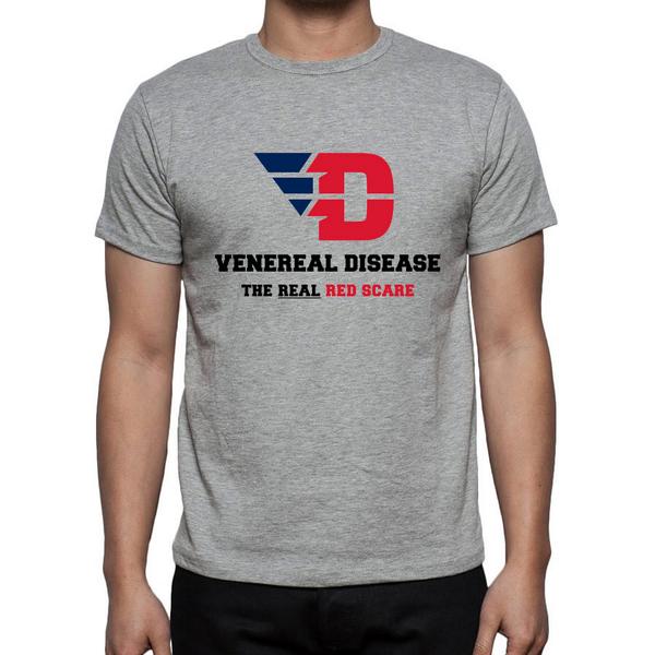
Among the hashtags that have been created are #weareVD and #UDnotVD. One fan on Twitter created an image of a T-shirt (at right) he expected to be sold at the university's bookstore.
The Dayton Business Journal compiled some of the better Twitter posts, including "Shout out to the Dayton University student intern who spent a full 7 minutes on MS Paint putting the new logo together" and "Branding Gone Bad: University of Dayton: We Love the VD Logo." Other comments praised the logo. A Facebook page has been created to call for a return to the old logo, or anything but the new logo.
An online petition states that if the university would add back the letter U and replace what many see as a V, the new design could work.
On Tuesday, there were reports that maybe the university was rethinking things. The Dayton Business Journal noticed that the version of the logo added to the center spot on the basketball court used all red, not the blue wings. To some, this didn't shout VD the way the blue version does. But a spokesman in an email to Inside Higher Ed denied that there was any reconsideration going on. He said that the university always planned multiple color schemes, one of which was all red.
The critic who tweeted that an intern must have been responsible for the new logo was incorrect. The official university statement on the logo says that the university worked with the branding agency 160over90 "with creative consultation from Nike." The statement also says that faculty, students, athletes and supporters of the university were involved in the design process.
"Building on the well known Dayton Flyers image while maintaining its classic feel, this new theme aims to attract more attention from high-quality student-athletes, while elevating the perception of the athletics program. The new Flyer identity is designed to be easily discernible, visually interesting, and unmistakable, setting the University of Dayton apart from any NCAA Division I school," the university statement said.