You have /5 articles left.
Sign up for a free account or log in.
For a college or university, unveiling a new logo is always a risky proposition -- students and alumni get attached to the old one, and any change feels wrong.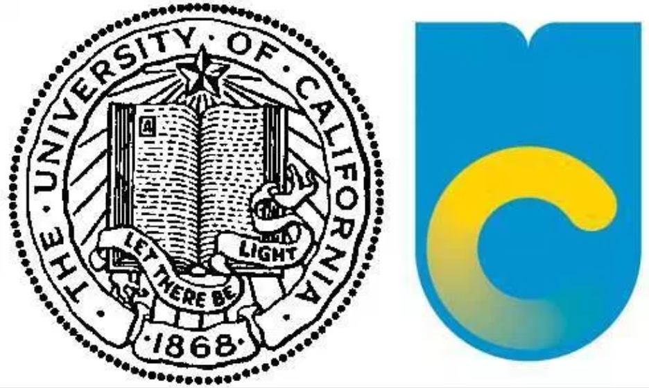
In 2012, the University of California system faced withering criticism for replacing its old "Let There Be Light" emblem with a new, modernist logo (right) -- to many people, it resembled a urinal. Earlier this year, the University of South Carolina took heat for a logo redesign of its own.
This time it’s the University of South Florida, which last week unveiled a redesigned academic logo of a muscular green-and-yellow bull that has students and alumni thinking about, of all things, retirement planning. The new design, many say, closely resembles that of the financial services firm Merrill Lynch, a bull that is often rendered in blue and white.
On Facebook, one user named Jason Litt commented, “I would like to speak with one of your brokers to set up a Roth IRA. As the market is trending up, I’d be interested in funding a significant amount to be invested towards my retirement …”
Another called the new design “TERRIBLE,” adding, “Can’t wait for Merrill Lynch to send a cease and desist use of this logo.”
For the moment, USF has no plans to abandon the bull, saying officials are listening to the crowd.
“We’re continuing to take feedback from our alumni and our students, which is what you need to do,” said chief marketing director Joe Hice. “We’re taking it seriously because it represents the academic success of the university over the last 63 years.”
Hice told the Tampa Bay Times that comments have been “positive as well as negative” -- actually, he said, the new bull was based on feedback about the previous one, introduced in September, which had a longer tail and wider stance in his hind legs, among other features.
He told Inside Higher Ed that USF officials settled upon the bull logo after they looked around the system’s campuses and concluded that they had no iconic buildings, such as an historic clock tower, to memorialize in a logo. “As a young university, we don’t have a whole lot on our campuses,” he said -- no ivy-covered halls or famous buildings. “We just don’t have a lot of that because we’re so young.”
Designers pulled ideas from bull statues on the all of its campuses, borrowing as well from USF’s “Bull U” athletic logo, a stylized U that looks like bull’s horns. Then they compared preliminary designs to those of other bull logos. “We found about 250 different bulls in use somewhere,” Hice said. The green USF bull made it through trademark comparisons “without any problems.”
Hice said USF considered simply updating a logo featuring the USF acronym (right), but decided that it didn’t set the system apart from the state's other public universities, which number nearly a dozen. “You’ve got USF, FSU, UF, UCF, FIU, FAU -- it really kind of becomes an alphabet soup, and it was confusing to students.”
The Times reported that the new, five-month redesign added nearly $8,000 to the $47,000 design process. According to invoices it examined, Tampa-based Spark Branding House spent 47 hours shrinking the bull's tail, bringing its back legs a bit closer together and drawing a line connecting the bull’s chest to its right front leg.
USF posted the new logo on its main Facebook page on March 12 -- in just two days, the logo generated nearly 200 comments, most of them not so bullish.
Among those lodging criticisms are wealthy alumni, the Times reported. Jeffrey Fishman, an alumnus and donor, said the logo “is not the best foot forward.”
Fishman, who said that he has given at least $1.45 million to USF Tampa since graduating in 1992, added, "I think they went down a path and now don't know how to get off that path and onto another."
Hice said the new logo is a part of a larger marketing campaign that USF is launching this month.
“We’re just continuing to take feedback” on the logo, he said, but the final decision may well rest with the university’s new president, who will likely be announced Friday -- the search is nearing its end, Hice said, with all four candidates visiting the system’s campuses this week.
Michael Morrow, a Portland, Ore., designer whose firm has created logos for colleges that include Bowdoin College’s polar bear, took one look at the new USF bull and said it's worth fighting for. “Ya know what, I like it!” he wrote via email.
He also liked the green-and-yellow color scheme of the new design.
“It’s not perfect,” Morrow said. “Obviously it is similar to the iconic Merrill Lynch bull, which I love. But for a college brand I like the progressive attitude. Way better than the previous logo, which looks the same as every other university in the world.”
USF clearly took a risk, he said, knowing it would be criticized -- Morrow said “whining” accompanies any brand redesign.
“Everyone thinks they’re a designer these days, so a thick skin is required of university stakeholders who get behind something different,” he said. “I also appreciate the effort to connect the bull icon to the existing athletic icon. Smart.”