You have /5 articles left.
Sign up for a free account or log in.
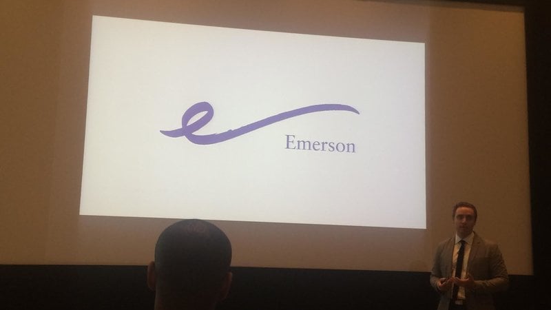 A new logo for Emerson College (at right) is receiving widespread criticism from students and alumni. “This new logo does not represent the dedication, hard work and creativity of the students, alumni, teachers and faculty of Emerson College. It is not a clear signifier of our school and is being compared to ‘the breast cancer ribbon,’ ‘the cup from the ’90s’ and looking like a ‘laser hair removal’ logo,” says a petition against the new logo. An editorial in the student newspaper, The Berkeley Beacon, called the new logo “little more than an errant pen mark” and “worse than ugly and worse than trivializing.”
On Twitter, critics of the logo are having a field day.
Andy Tiedemann, vice president for communications and marketing at Emerson, told The Boston Globe he thought many people criticizing the logo don't have full information about it, such as that it need not be only purple and that it could be used in various ways with the institutional name. When people have been given full information, he said, “people could see the potential of how we could use it” and “we got … an overwhelmingly positive response.”