You have /5 articles left.
Sign up for a free account or log in.
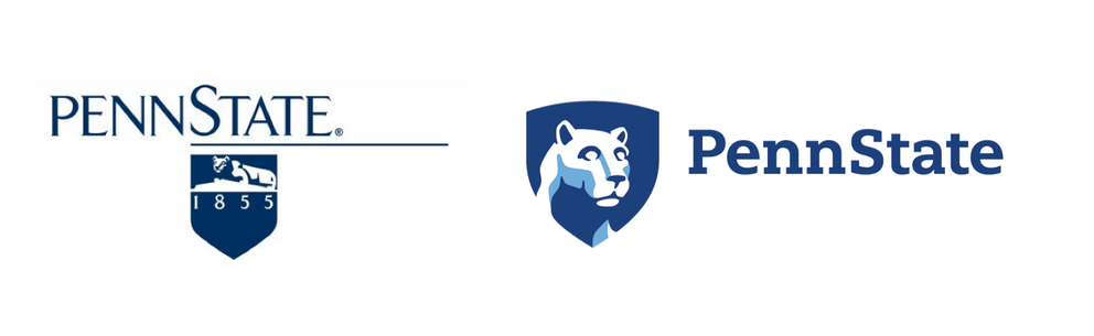 Pennsylvania State University this week unveiled a new academic logo. And even though the university isn't touching sports imagery, alumni are not happy. In the image at right, the old logo is on the left and the new one on the right. The university said that the old logo was designed in the '80s, before web use was key. Of the new logo, Penn State said: "The updated mark focuses on the head and face of the Nittany Lion Shrine in a more contemporary and engaging way, continuing its heritage and providing the same sense of stature as the sculpture. A slight curve at the top of the shield makes it more distinctive, while reflecting the shape of the lion. Additionally, the lion is now positioned to look forward and connect with the Penn State name."
On Twitter, many said that the new logo's lion appeared to be a zombie or the mascot for a financial institution. Other choice comments included, "The new Penn State logo would be perfect if Penn State was a pre-K," "new Penn State Nittany lion logo looks like that hypnotized dog looking at cupcakes," and "The lion in Penn State’s new academic logo looks like it’s just rolled around in a bunch of catnip."
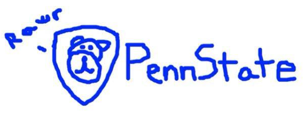
One alumnus posted an apparently rejected alternative.