You have /5 articles left.
Sign up for a free account or log in.
The poster session is an important but usually humble component of an academic conference -- though you’d never know that from a promotional video for one held at the University of Oxford this month. The clip looks like the trailer for a sci-fi Hollywood blockbuster. The name of the conference, Force 2015, sounds like one, too.
Besides its snappy acronym, the Future of Research Communication and e-Scholarship group (“a community of scholars, librarians, archivists, publishers and research funders”) has a manifesto offering a comprehensive vision of post-Gutenbergian intellectual life. Issued in 2011, it forecasts “a future in which scientific information and scholarly communication more generally become part of a global, universal and explicit network of knowledge; where every claim, hypothesis, argument -- every significant element of the discourse -- can be explicitly represented, along with supporting data, software, workflows, multimedia, external commentary and information about provenance. In this world of networked knowledge objects, it would be clear how the entities and discourse components are related to each other, including relationships to previous scholarship; learning about a new topic means absorbing networks of information, not individually reading thousands of documents....”
The new Web site 101 Innovations in Scholarly Communication may not have been intended as an interim report on how that future is shaping up, but it has the features of one even so. It’s the online complement to the Force 2015 poster of the same name, prepared by Jeroen Bosman and Bianca Kramer, both from Utrecht University Library in the Netherlands. (Bosman is the subject librarian in the geosciences; Kramer, in the life sciences and medicine.)
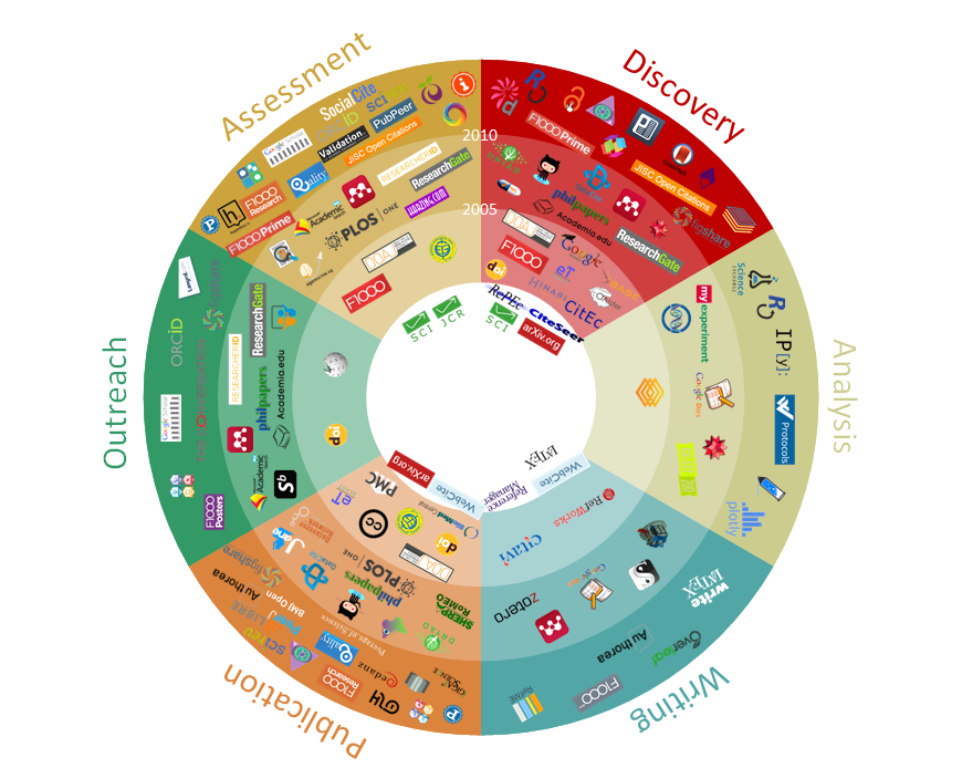
The most striking element of both the poster and the site is a multicolored circular chart that looks something like a zodiac or gaming wheel. (See bottom of this article for a larger version than appears on top.) It flashes by in the opening seconds of the aforementioned video, too fast for the viewer to notice that it is divided into six sectors: discovery, analysis, writing, publication, outreach and assessment. There are little logos in each, representing digital tools and products. You find the Google Docs icon in “analysis,” for example, and Zotero in “writing,” while academia.edu appears in “outreach.”
It’s the Great Cycle of Research Life, so to speak -- beginning with, and ever returning to, the zone marked “discovery.” It would be possible to argue with how sequential the process is in real life, and I’m not persuaded that some of the icons fit perfectly into their assigned slots. But another element of the chart’s design adds to its value by conveying the pace of change. The circle actually consists of concentric circles, marking off five-year intervals between 2000 and 2015. The location of an icon indicates when it came into use, with a very few, in the chart's core, having been around way back in the 1990s.
After contemplating the 101 Innovations mandala for a while, I contacted the site's creators in hopes of understanding its mysteries. At a poster session, there’s usually someone around to explain things only implicit in the poster itself, which can otherwise be puzzling.
That’s true especially of the diagrams making up the site’s “workflow pages.” Each resembles an extremely simple flowchart: a series of boxes, representing the six phases of research, with various logos plugged in. (Rather than endure a thousand words of description, just go have a look.) The charts also had labels such as “traditional” and “innovative.”
The parts each made sense, but the whole seemed opaque. Kramer elucidated things in an e-mail discussion, with some of her responses prepared jointly with her collaborator, Bosman. The site represents the tip of an iceberg: they have collected a database “contain[ing] details of some 15 attributes of over 400 innovative tools and sites,” most of which didn’t make it to the poster or Web site. “We are curious [about] the range of innovation,” they told me, “not the entire range of products per se.”
My best guess had been that the workflow charts might have been intended as recommendations of how researchers could combine the available digital tools. That, it turns out, was wide of the mark. The charts are heuristic rather than prescriptive.
“None of the workflow charts are meant as templates for researchers to adopt,” Kramer and Bosman explained, “more as primers for them to think about the tools they use and the type of workflow that best characterizes the way they work.” The charts provide “a starting point for discussions with researcher groups, such as graduate students, postdocs and faculty,” in order to determine existing practices and developing needs.
The goal is to elicit users’ “reasons for choosing specific tools -- what factors influence their decisions to switch to new tools and incorporate them” in their work. “[W]e plan to have a closer look at the coverage of digital humanities tools in our database, and look at disciplinary variations in our interpretations of most important developments, opportunities, etc.”
Bosman and Kramer also developed a typology of scholarly workflows, ranging from the neo-Luddite to the way-early adopter. “[W]e defined 'traditional' as a type of workflow that essentially would not have altered much from that of the print age, ‘modern’ as making use of online tools that enable researchers to consume information/functionality (roughly Web 1.0), ‘innovative’ as using more recent tools that enable online discussion, collaboration and active contribution (roughly Web 2.0) and ‘experimental’ as using tools that are currently being developed and have yet to establish themselves (‘bleeding edge’).”
The charts mention “virtual suites,” with no explanation. That turns out to be a reference to the shape of things to come: integrated packages of tools covering every stage of the research project, from brainstorm through the publication of scholarship and the archiving of data.
“My impression,” wrote Kramer, “is that publishers/organizations are working more and more towards providing tools for all stages of the workflow, and will probably start marketing them as such in the future. It is of course up to any individual researcher to decide whether she/he would want to use such a suite in its entirety, but it seems to be to the benefit of the publisher to offer the possibility, and convince institutions to buy into the whole package deal. Such developments would encourage siloing of workflows, with potential limited interoperability with other tools and thus lock in to a specific publisher/organization. This is not necessarily a good thing.”
Agreed. The next step would be for researchers to sign over their own brains to the company providing the suite, which seems like carrying the principle of intellectual property altogether too far.
“On the other hand,” Kramer pointed out, “we found that many new tools have been developed by researchers at the Ph.D./postdoc level (interestingly, many of them biomedical or bioinformatics scientists) who are frustrated with the current solutions available to them. Another trend we observe is that once these innovations prove useful and popular, they are often bought by large publishers.”
So in the foreseeable future “there will remain a mixture of new, independent innovations and consolidation of existing tools, often in a publisher's ‘suite.’”
The alternative would be a large-scale return to paper and ink. Some of us wouldn’t mind, but nobody should count on it.